Designing a File Browser

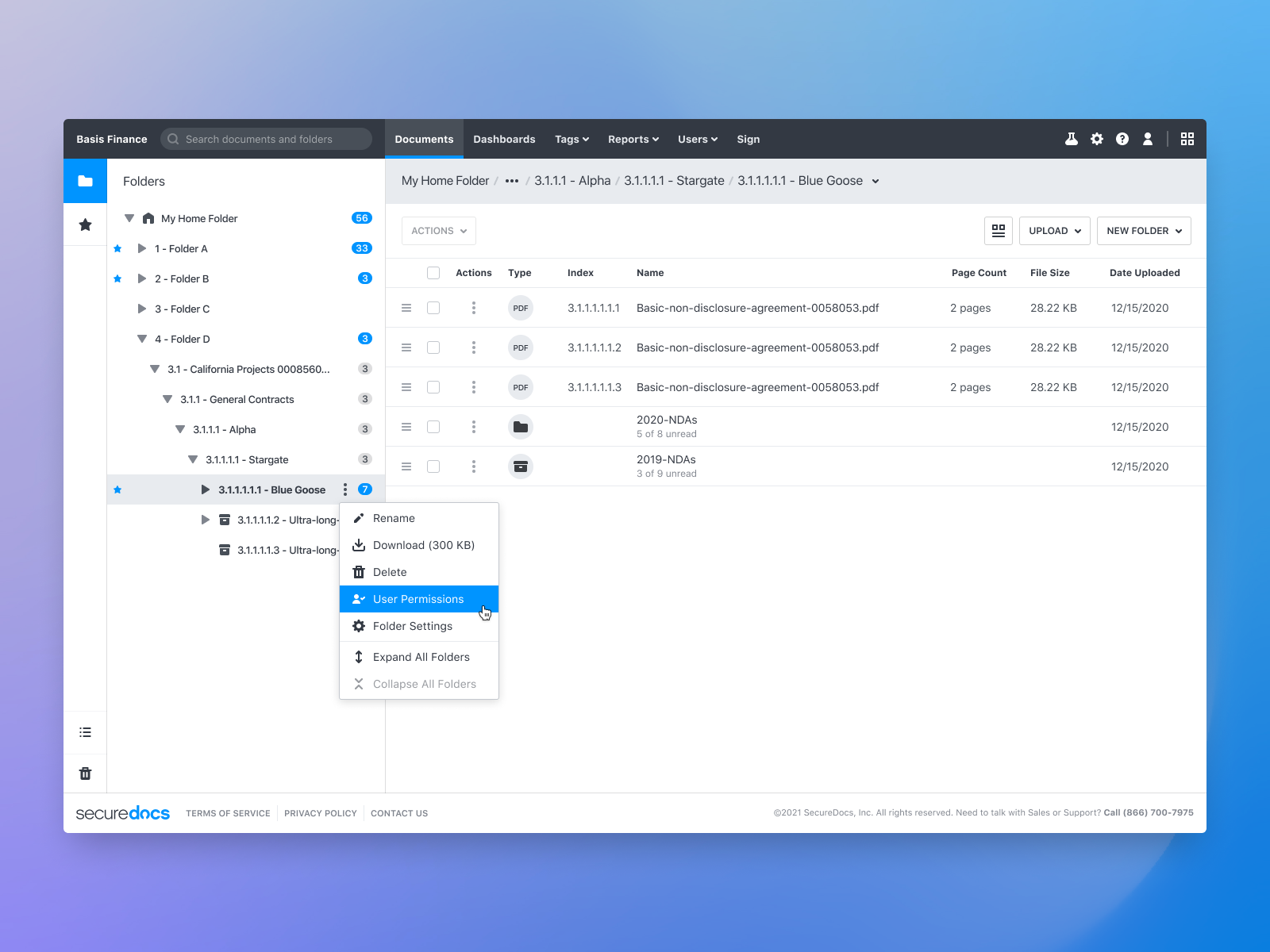
The file-browser application with the folder explorer sidebar.
- Organization
- SecureDocs
- Roles
- Prototyping, UX Design, Visual Design, Front-End Development
In 2018, I became SecureDocs' first UI Designer and worked closely with the engineering team. My primary objective was to establish a simple but effective design process for our expanding cross-functional team. It included developing prototypes for product development and constructing a comprehensive component library to support engineers in implementing new features.
One of my early projects where I utilized this process was redesigning SecureDocs's file browser interface, an essential tool for our customers. It was a collaborative effort and a notable achievement for our small, cross-functional team.
The main purpose of the file browser app is to serve as a centralized hub for customers to manage business documents, including contracts. We aimed to create a user-friendly interface similar to Microsoft's "File Explore" or Apple's "Finder," allowing users to effortlessly interact with their documents with patterns such as drag-and-drop or contextual menus where they'd expect them.
Developing Details
Designing and developing for "effortlessness" is a major challenge in product design. When building the file browser, we remained focused on a few key elements to ensure it felt "effortless" to the customer. One particular aspect that demanded careful attention was the file browser's sidebar.
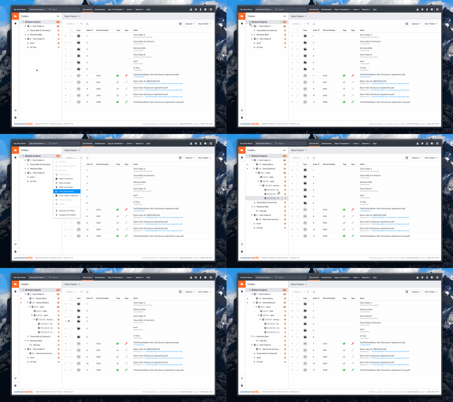
The primary function of the sidebar was to allow users to explore their folder structure, while the main section focused on the currently selected folder. In the sidebar, users can expand elements, nest folders, drag documents into folders, and perform additional actions. What was challenging for me was to provide a clean and intuitive design that supplied that functionality.

A look at some of the sidebar functionality.
Theming
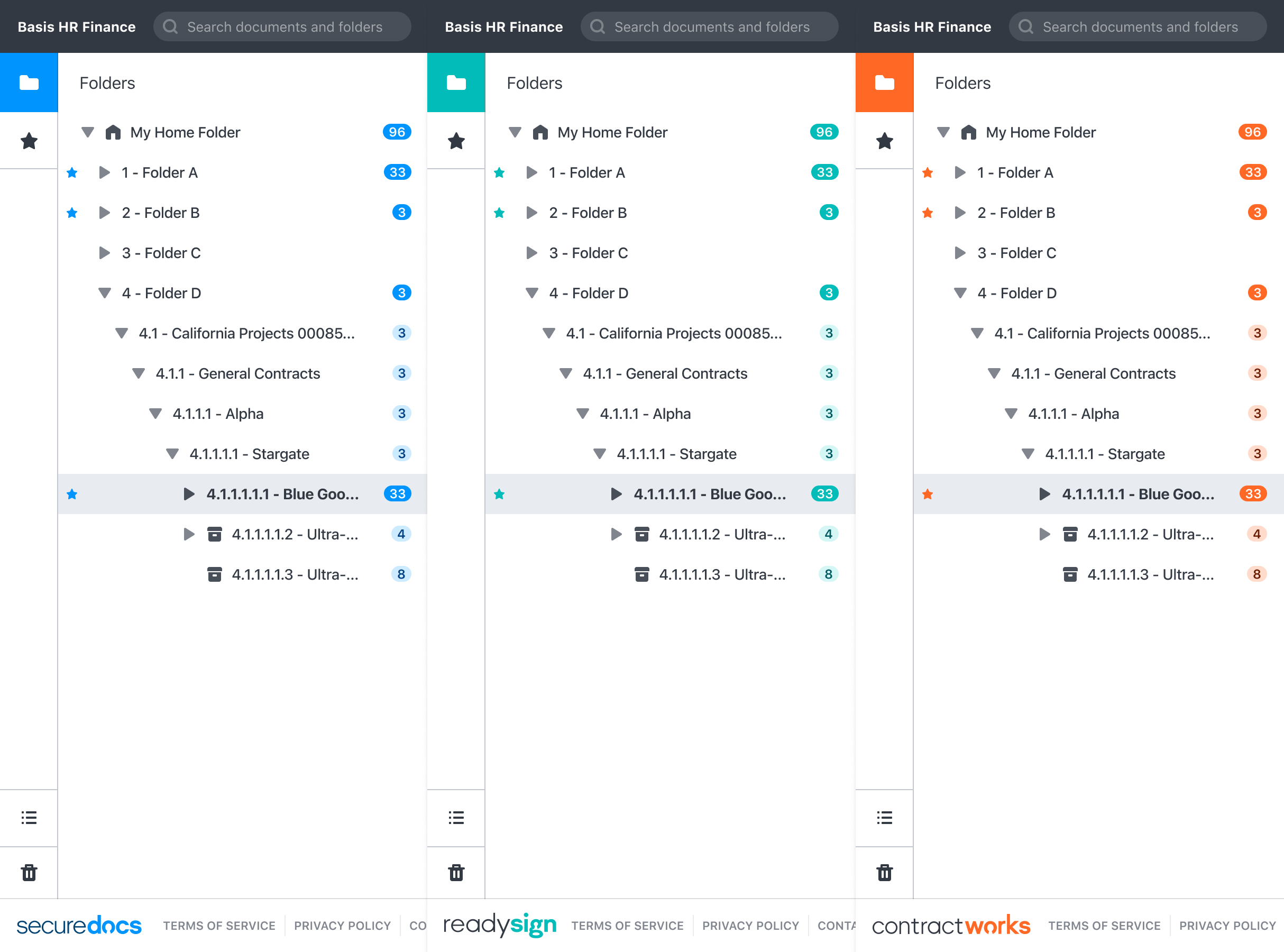
The SecureDocs application serves three markets, each with unique features and branding. To assist in marketing with the ability to promote three products without compromising the user experience, I developed a color-theming system for specific UI elements. This system allowed each product to have its distinct appearance while ensuring ease of maintenance.

Themeing displayed across the 'Sidebar' component.
Overall, this project provided me with a ton of valuable lessons. We established an efficient design process and closely collaborated with the engineering team to create a seamless user experience. We prioritized key elements such as the sidebar for easy navigation and action performance. The color-theming system demonstrated the importance of balancing branding and user experience. The most rewarding aspect was seeing how positively customers responded to the design, despite changes to familiar functionality. The feedback was overwhelmingly positive.